

Frontend design / HUD interface / community
Star Citizen Universe
An old community website with futuristic HUD panels, news feed, community column and navigation structure. For me, that interface connects cockpit thinking, adventure in space and an early visual direction.
Node SCU-013
Signal Online
Archive Interface / 2013
The case in 30 seconds
Star Citizen Universe
- Problem
- An old community website with futuristic HUD panels, news feed, community column and navigation structure. For me, that interface connects cockpit thinking, adventure in space and an early visual direction.
- Solution
- Futuristic community website with frontend, HUD panels and profile interfaces. The design collage shows the direction of the interface work.
- Role and focus
- Frontend, UI
- Status
- Early UI direction
- Result
- HUD collage, structure
Core story
Early HUD direction, personal fascination
Star Citizen Universe shows an early direction in my own interface work: logo, background, panels, data fields, profile screens and navigation were already consciously moving towards a futuristic HUD language.
The case connects early frontend and UI interest to the HUD style that has now been extended into the portfolio.
I personally follow Star Citizen because to me it shows what can arise when an ambitious universe, a high visual bar and an engaged community are developed together over a long period of time. The combination of scale, detail, technological innovation and an involved community strongly appeals to me.
Personal motivation
From cockpit dream to digital universe
The space layer appeals to me because it brings together adventure and systems thinking: a cockpit full of information, a course that you have to understand and a world that is bigger than the immediate screen. That ties in with my earlier interest in jets, later visible in Battlefield and Entropia.
This page is emphatically not a work for Star Citizen itself. It is my own community and interface work around that fascination, and a personal long-term reference for how world, community and visual quality can reinforce each other.
HUD thinking from the cockpit
Screens, panels and data fields were designed as part of a recognizable sci-fi environment with a clear pilot's eye.
Community navigation
The site combined profile information, community context and navigation into a visually coherent whole that provides space for engaged members.
Technical but readable
Contrast, lines and panels had to feel futuristic without making the information unusable.
Long term reference
This old direction explains why the current portfolio interface feels logical within my work and my fascination with larger digital worlds.
Visual basis
The parts that determine the direction
Collage, background and identity together set the direction: dark data layers, thin cyan lines, corner markers and an interface that feels like a cockpit.


Interface
One full screen, then the parts
The profile page first shows the whole. The cards below then name the most important parts of navigation, search, profile data, lists and community.
The entire interface as context
Avatar, network ID, ship list, profile actions, new citizens and activity come together in one coherent cockpit view.
02 / 08 / Interface parts
The interface in parts
Seven compact maps make the functions readable without presenting concept images as a full-fledged final work.
A menu as a cockpit strip
Equal tabs, an active glow and short cyan corner lines keep six main routes scannable.
Search as instrument panel
Dark fields, thin edges and a bright action follow the same compact filter logic as the RSI reference.
Members as a living network
Avatar, location, join date, posts and status each have a fixed information column.
Identity and actions in one node
Network ID, location, ships and account actions together form a clear personal control panel.
Discussions without visual noise
Icon language, category, numbers and last activity remain readable within thin data rows.
The conversation at message level
Author, rank, time and content remain recognizably separated within one compact message module.
Groups get their own signature
Emblem, membership, language and recruitment status make organizations directly comparable.
01 Original layout proportions
02 Saved profile components
03 Historically plausible addition
04 Not an official Star Citizen product page
Online community
The interface belonged to a real community place
Star Citizen Universe went public online in early 2013 as an English-language fan community for news, member profiles and discussion about Star Citizen.
March 12, 2013
The home page
Open the archived site and see how the community environment was presented publicly at the time.
Open site snapshot ↗ January 10, 2013The first public announcement
A 2013 fan project post introduces Star Citizen Universe as a community place for sci-fi and space sim enthusiasts.
Open announcement ↗Interface analysis
Four design choices
The collage shows the interface as more than a separate image: as structure, navigation and visual language for a community in a larger universe.
Profile panels
Personal information and status are placed in compact panels, befitting a sci-fi dashboard.
World + community
Members, roles and context are given their own place, so that visitors can enter a larger universe instead of just seeing a separate fan page.
Navigation system
The interface uses clear zones and repeatable frames to keep complex information scannable.
Long term reference
Lines, contrast and technical details make the visual language recognizable and show why a growing world with community continues to inspire me.
The interface in pictures
What the HUD language does
The collage brings together my frontend, HUD and community thinking: information remains scannable while the environment feels large and technical.
Panels and data fields
The collage shows interface fragments with sci-fi panels, profile information and technical visual language.
Community context
The screens point to navigation, member information and community components in a visual system.
Technology with atmosphere
The combination of dark space, clear lines and compact information gives the community its own cockpit feeling.
Forerunner of current style
This old design style explains why the portfolio interface with HUD lines and panels fits my work substantively.
Frontend design
HUD interface
Community structure
Profile panels
Visual hierarchy
Interface development
Next cases
HUD to other cases
From interface collage to community,Webdevelopmentand AI systems.
 Community / events
Hollands Glorie
Dutch-speaking World of Warcraft community with events, cosplay, promotional images, Outpost collaboration and media attention via #FIRST.
Community / events
Hollands Glorie
Dutch-speaking World of Warcraft community with events, cosplay, promotional images, Outpost collaboration and media attention via #FIRST.
 Game knowledge / community leadership
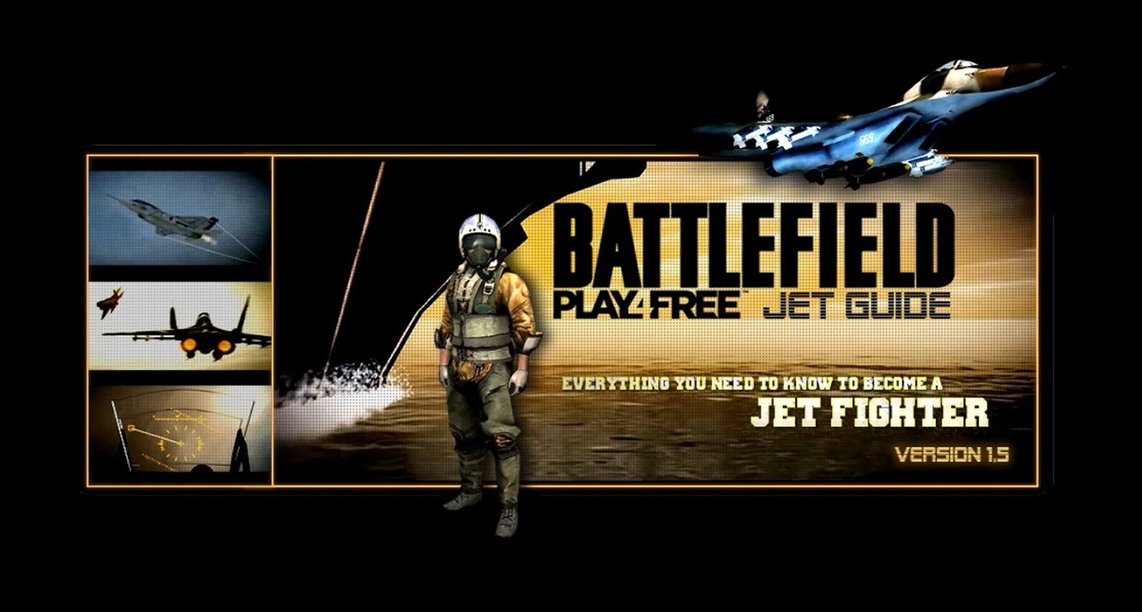
Battlefield Play4Free
Golden case in which in-depth game knowledge grows into guides, visualizations, community leadership, player coaching, team play and a joint world title.
Game knowledge / community leadership
Battlefield Play4Free
Golden case in which in-depth game knowledge grows into guides, visualizations, community leadership, player coaching, team play and a joint world title.
 SME / restaurant / QR flow
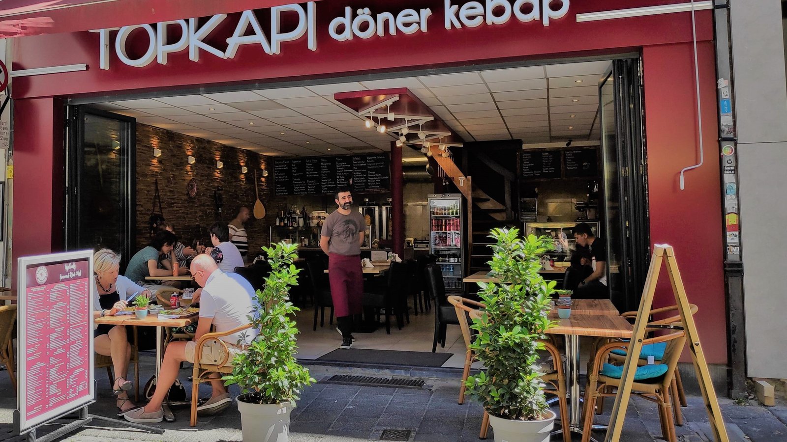
Topkapi Restaurant
Restaurant website from 2020 in which atmosphere, menu, QR routing and visitor registration formed one practical guest journey.
SME / restaurant / QR flow
Topkapi Restaurant
Restaurant website from 2020 in which atmosphere, menu, QR routing and visitor registration formed one practical guest journey.
 Steuncase / merk & operatie
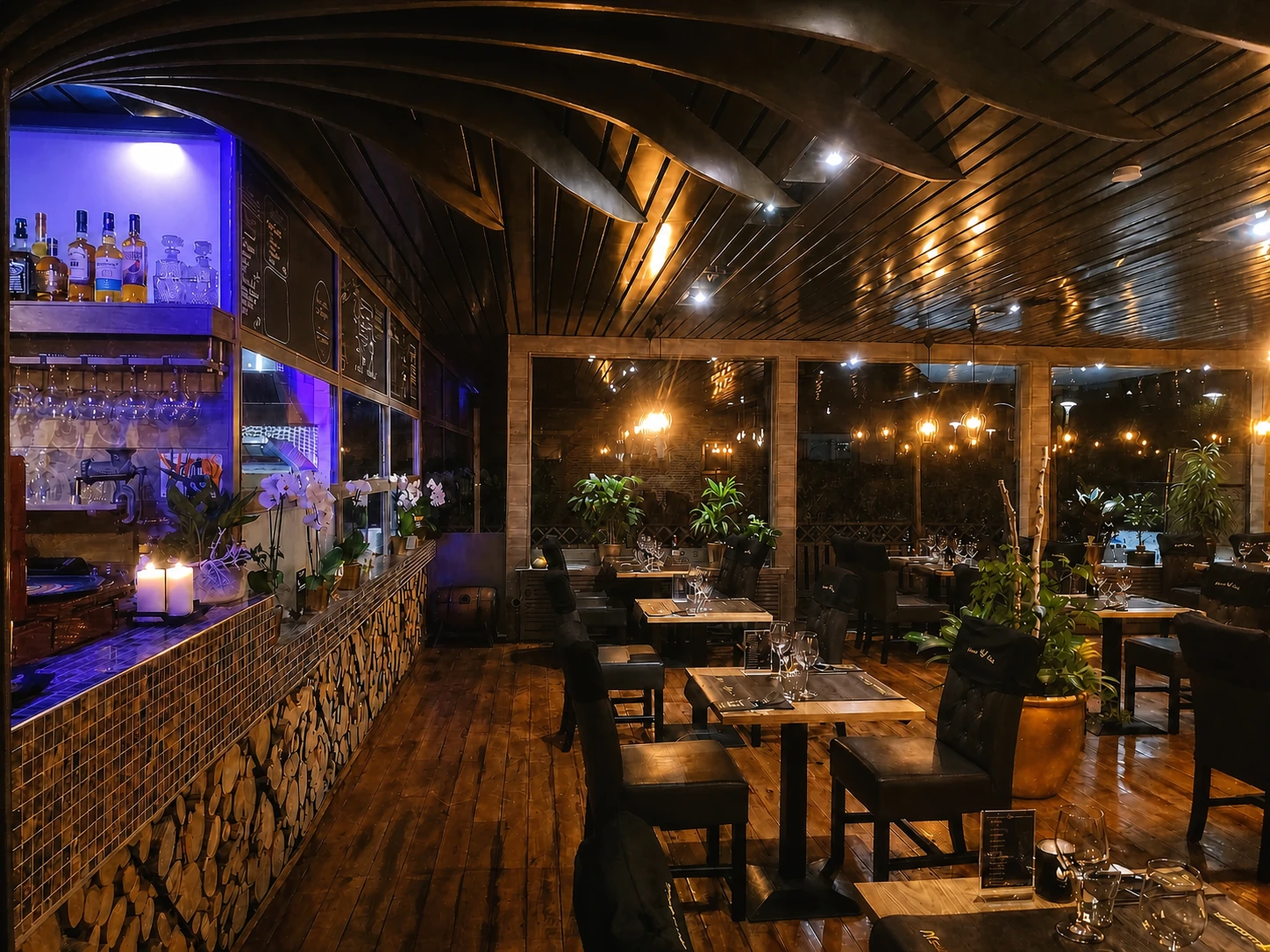
Phoenix Garden
From outdated grill restaurant to warm hospitality concept with interior, branding, menu, QR flow, team and operation.
Steuncase / merk & operatie
Phoenix Garden
From outdated grill restaurant to warm hospitality concept with interior, branding, menu, QR flow, team and operation.