

Hospitality concept / branding / operation
Phoenix Garden
An existing grill restaurant was given new life as Phoenix Garden: a place around fire, beef, wood, brick and a warm hospitality concept. My role ranged from interior and brand development to menu, marketing material, QR customer flow, team building and operational design as one sensory total story.
The case in 30 seconds
Phoenix Garden
- Problem
- An existing grill restaurant was given new life as Phoenix Garden: a place around fire, beef, wood, brick and a warm hospitality concept. My role ranged from interior and brand development to menu, marketing material, QR customer flow, team building and operational design as one sensory total story.
- Solution
- From outdated grill restaurant to warm hospitality concept with interior, branding, menu, QR flow, team and operation.
- Role and focus
- Fire, interior
- Status
- Worked case
- Result
- Concept, flow, operation
Personal basis
Catering industry inside and out
Phoenix Garden could only be so personal because I had worked in the catering industry for years: from local restaurants, cafés and brasseries to large events and top locations. Through JMW and other hospitality parties, I worked at places such as the Amsterdam Arena, RAI, Schiphol and Jaarbeurs, around trade fairs, concerts and major public events.
In Antwerp, this practice also received a high-end frame of reference at Josephine's: an environment in which kitchen, bar, interior and service consciously came together at a high level. That experience made it very clear to me why a strong catering concept does not consist of decor alone, but of one consistent experience for the guest.
That experience taught me that hospitality does not consist of one part. Taste, smell, light, sound, routing, pace and careful detail together form a guest's memory. Phoenix Garden became my opportunity to not only support that belief, but to make it visible from concept to realization.
Designs for all the senses
A route that you feel
You shouldn't be able to see Phoenix Garden alone. The room had to tell you as soon as you entered what would happen on the table, at the grill and in the service. That is why scent, warmth, material, light and movement were designed as parts of the same guest experience.

Fire and flavor as direction
The Argentinian grill and the beef focus determined more than the menu: they gave rhythm to the smell, language and expectations of the restaurant.
Material should show character
Brick, wood, black leather, green and warm light layered the space without making it restless.
Service remained visible
The open kitchen and serving hatch made the preparation experience enjoyable, while the routing for team and guest had to remain practical.

The challenge
Restyling to Phoenix Garden
Phoenix Garden was created in Schoten, just outside Antwerp and close to Brasschaat and Schilde, on the site of an existing restaurant previously called The Grillfather. The basis was there, but the business required a clear restyling: a new identity, more atmosphere, a sharper story and a guest experience that better suited a contemporary grill restaurant.
The phoenix story was consciously continued: something new had to arise from an existing business. The name, facade signing, menu, table details and the link with Grimbergen, where the phoenix is also part of the brand story, reinforced that idea of rebirth. Fire, flesh and revival were not separate marketing words, but one coherent promise.
The space itself was all about warmth, grill, wood, fire, brick, black leather and farm-like details such as the cow's head on the wall, the wheel with lamps on the ceiling and more antique decorative pieces. The open kitchen, the serving hatch to the room and the compact bar meant that guests could really experience the preparation and service. The ambition was clear: to become the barbecue and meat restaurant of Schoten and the surrounding area, with beef and the Argentinian grill experience as a clear core.
Before and after
Hospitality atmosphere
The transformation was not in a separate piece of decor, but in the overall image: color, material, light, routing, table presentation and brand details together created a new restaurant feeling.


My contribution
Concept to operation
For me, the value was in the combination: determining creative direction, making tangible materials and at the same time running a restaurant operationally.
Interior & atmosphere
Warm lighting, wood, brick, plants, black leather, farmhouse decoration and sight lines to the kitchen and grill as one sensory atmosphere carrier.
Branding & visual identity
Phoenix logo, custom facade signage with light, Grimbergen hook, menu style, table material, flyers and visual details in the business.
Menu & customer flow
Argentinian grill positioning, beef focus, full-color menus, QR solution, takeaway/home delivery and practical information at the table.
Operational structure
Suppliers, stock, administration, Lightspeed, planning, team coordination, onboarding and daily management.
Realization under preconditions
High detail, conscious budget
The challenge was not to spend an unlimited budget, but to build a high-quality whole with targeted choices. By purchasing internationally, doing our own research and selecting materials precisely based on function and atmosphere, the bar, signing, lighting, menus and interior could be developed much further than the available budget allowed at first glance.
The timing was then hit hard by the corona period. This did not change the achieved quality of the concept, but it did limit the time in which the business could build up its commercial rhythm. That is why this case mainly shows what has been made tangible: a complete, workable environment with a clear world of its own.
Signature on the street
A facade with promise
The Phoenix signing was not treated as a separate decoration. We designed the same recognizable signature for the street facade and the entrance to the parking lot: a deep black, textured back wall, individually cut-out letters and the Phoenix sign, finished with gold-colored fronts and warm indirect LED light.
To make that quality achievable within a realistic budget, we broadened the search beyond the local market. Ultimately, we found a specialized partner in Turkey who could realize the custom components at the desired level. This made international sourcing a concrete force: premium execution, carefully tailored to the warm lighting and materials inside.
Material
Lighting
Recognition


From concept to operation
Workable on a daily basis
For me, this wasn't just about restyling. The strength lies in connecting brand choices, space, customer information and practical restaurant management.
Concept & story
Phoenix, grill, warmth and rebirth were translated into a recognizable direction for taste, smell and story.
Space & atmosphere
Light, wood, leather, brick, plants and a view of the kitchen made the positioning physically tangible.
Customer flow
Menu, QR material, facade signage, open kitchen and table points helped guests understand what the business was more quickly.
Daily operation
Suppliers, stock, planning, team and systems had to bear the experience every day, even under corona pressure.
Doing business under pressure
The operation continued
Phoenix Garden had only just opened when Belgium decided that restaurants had to close again from October 19, 2020. After a complete renovation and only a short period with guests in the room, the concept had to be immediately converted from a restaurant experience to takeaway and home delivery.
This did not require a temporary emergency solution, but a second version of the same company: different menu, different logistics and different contact moments, while the recognizable Phoenix identity had to remain intact.


-
01
Menu redesigned
The emphasis shifted from dishes that had to come straight from the grill to the table, including burgers and spare ribs that could travel better.
-
02
Order flow redesigned
Pickup, home delivery, QR material and platform orders were given a workable place next to the kitchen, planning and communication.
-
03
The brand remained recognizable
Even without a physical guest trip, the name, color, tone of voice and presentation remained visible as one Phoenix Garden story.
The real outcome
Not waiting for conditions to return, but adapting the concept quickly enough to continue to function under exceptional pressure.
Historical context: decision of October 16, 2020, closure of catering establishments from October 19From gate to plate
A brand that you enter
The additional image series makes the entire guest journey visible: arrival under the Phoenix gate, reception at the bar, a warm table and dishes that combine grill, presentation and recognizable brand details.


Images from the business
Brand, space, execution
The selection deliberately shows different layers: exterior facade, light signage, interior, compact bar, menu design, QR material, kitchen, grill positioning and small brand details. The additional image set makes both the overall story and the individual parts of the execution easy to read.

What is visible
Layers of transformation
Phoenix Garden is the most visual entrepreneurial case: interior, brand, menu, customer flow and operation are all visible in the available material.
Before and after
The comparison immediately makes the transition from an existing business to a hot grill concept visible.
Signage and details
Logo, lighting signage, table details and menu style show that the identity passed through multiple touchpoints.
Menu and QR material
The menus and QR flyers show how brand experience and practical information came together.
Working catering environment
The images support a broader role: concept, implementation, team, budget-conscious choices and daily restaurant practice.
Why this is relevant
Design that has to work in the business
Phoenix Garden is not a pure design case and not a pure management case. It is precisely the combination that makes him valuable: concept thinking, visual execution, practical organization and entrepreneurship had to convince and continue to work under exceptional pressure at the same time.
For employers and catering entrepreneurs, this shows that I can convert ideas into spaces, materials, menus, customer flows and processes that function in the real world, from facade and laid table to QR code and delivery order.
Concept development
Interior feeling
Branding
Photoshop/Illustrator
Menu design
Hospitality operations
Lightspeed
Team coordination
Suppliers & stock
Next cases
Towards systems thinking
Phoenix Garden shows entrepreneurship and physical brand experience. From there you can move on to cases around AI, community platforms and older interface projects.
 Community / events
Hollands Glorie
Dutch-speaking World of Warcraft community with events, cosplay, promotional images, Outpost collaboration and media attention via #FIRST.
Community / events
Hollands Glorie
Dutch-speaking World of Warcraft community with events, cosplay, promotional images, Outpost collaboration and media attention via #FIRST.
 Game knowledge / community leadership
Battlefield Play4Free
Golden case in which in-depth game knowledge grows into guides, visualizations, community leadership, player coaching, team play and a joint world title.
Game knowledge / community leadership
Battlefield Play4Free
Golden case in which in-depth game knowledge grows into guides, visualizations, community leadership, player coaching, team play and a joint world title.
 SME / restaurant / QR flow
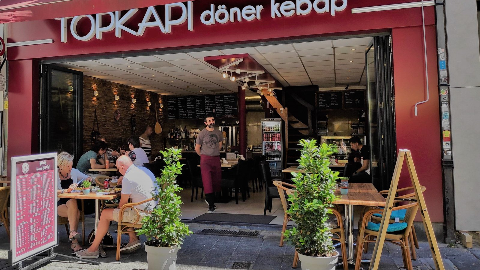
Topkapi Restaurant
Restaurant website from 2020 in which atmosphere, menu, QR routing and visitor registration formed one practical guest journey.
SME / restaurant / QR flow
Topkapi Restaurant
Restaurant website from 2020 in which atmosphere, menu, QR routing and visitor registration formed one practical guest journey.
 Current line / AI adoption
IttesAI Nederland
Market introduction around AI adoption: local context, targeted pilots, feedback and a responsible route to repeatable growth.
Current line / AI adoption
IttesAI Nederland
Market introduction around AI adoption: local context, targeted pilots, feedback and a responsible route to repeatable growth.